Sappi: The Standard
The Sappi Standards are a series of educational publications created for Sappi Fine Papers demonstrating how some of the hundreds of printing techniques can be used to promote better communication. Each focuses on different aspects of print design:
Each Standard is a standalone publication with a unique theme and design concept. A consistent typographic styling unites the series, and a series of speaking events accompanied the launch of each Standard, together with the release of videos highlighting the specific themes of the book.
The Standard 1: Prepress: Preparing Files for Print
This is a resource of “best practice” tips, approaches, and reminders, and shared with us by prepress specialists, printers, and designers.
The Standard 2: Managing Color

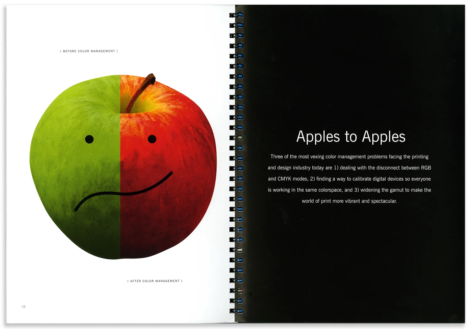
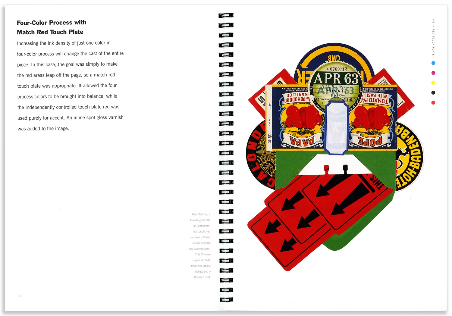

The theme of effective color management is demonstrated throughout the brochure with reviews of printing techniques from 4 color to 8 color printing, special ink combinations, a glossary of terms, and a color “Do’s and Don’ts” section.
The Standard 3: Varnish & Coatings

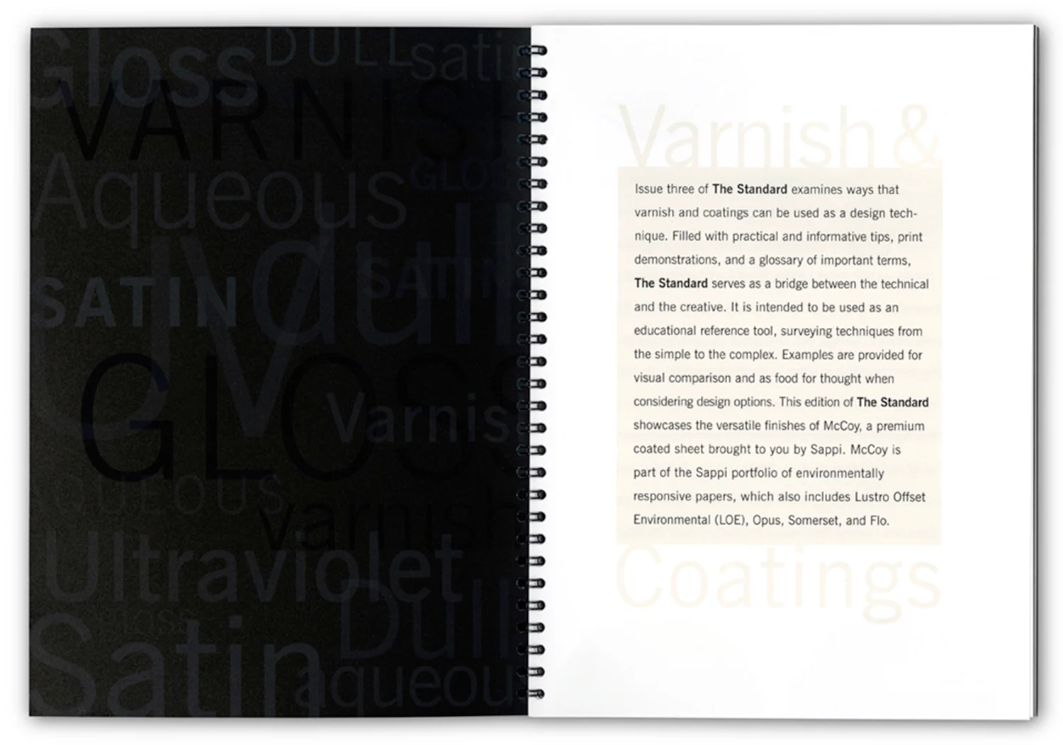


During the past five years, print technologies have expanded dramatically, especially in the area of varnishes and coatings. The Standard 3 demonstrates the best of the new techniques with various examples of textures including: rough and smooth, shiny and dull, and clear and opaque. Each example of the finish is articulated with their specific attributes and shown with and without the varnish or coating.
The Standard 4: Scoring & Folding


The creative use of folding techniques is an under utilized area of design communication. This edition introduces the array of “folding families,” demonstrates the creative use of folds in printed samples. It also presents the pros and cons of different techniques and an actual folding samples of eight specific folds, from the simplest to the most complex.
Sappi Basic Folds: Created as a promotional piece for the Sappi Standard 4: Scoring & Folding, this video demonstrates how elegant and powerful folding can be. Set on a black backdrop, a pair of hands showcase a variety of folds synchronized to triumphant classical music. This video was shot by Terry Heffernan, edited and mixed by Dan Hayes, and features Kit Hinrichs’ hands.
The Standard 5: Special Effects


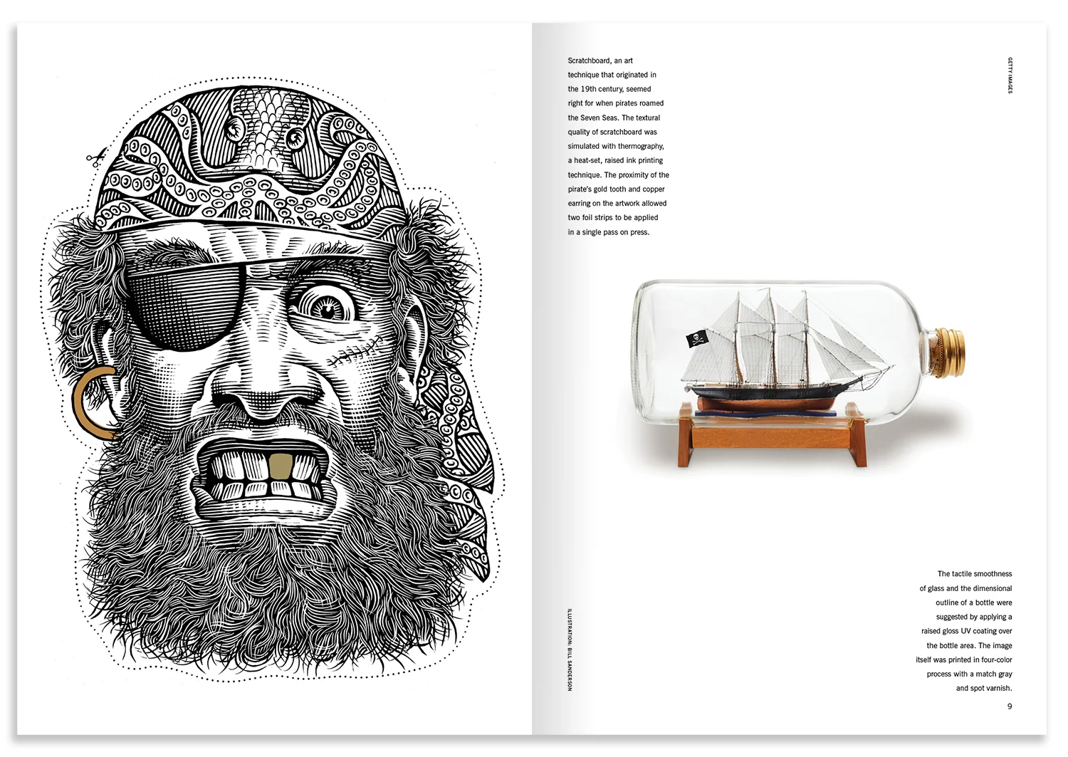


This edition was created to demonstrate the dozens of special effects that can expand the designers knowledge of print communications. This brochure was created in conjunction with 826 National, a non-profit that provides tutoring services to children. Each chapter of the brochure was themed around the 826 stores. The stores include: The Pirate Store, Superhero Supply Co., The Time Travel Mart, Robot Supply & Repair, Secret Agent Supply Co., The Bigfoot Research Institute, The Museum of Unnatural History and The Space Travel Supply Co.
We also created a unique set of cards inspired by The Standard 5: Special Effects, which features the fanciful retail concepts of 826 National and uses various special effects.
Sappi The New Face of Special Effects: Created as a promotional piece for the Sappi Standard 5: Special Effects, this video showcases the variety of imagery and themes seen in the book. Set to upbeat jazz, faces transition and transform from one to another. This video was edited and mixed by Dan Hayes and the artwork was created by many different artists.
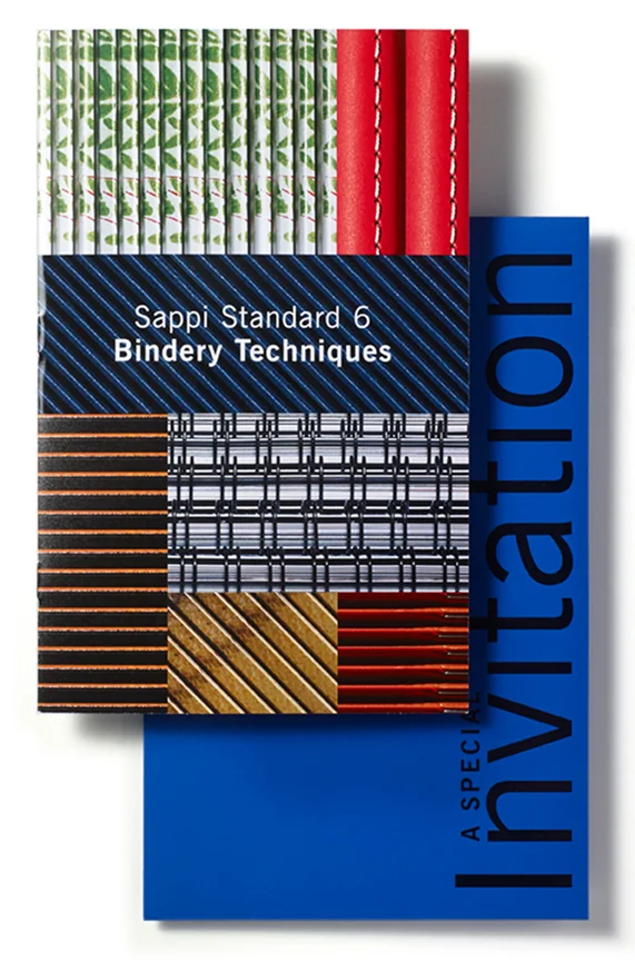
The Standard 6: Bindery Techniques
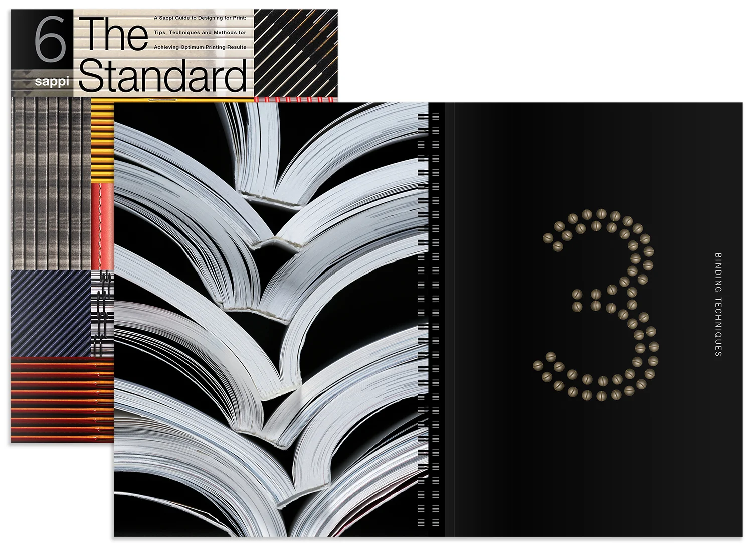
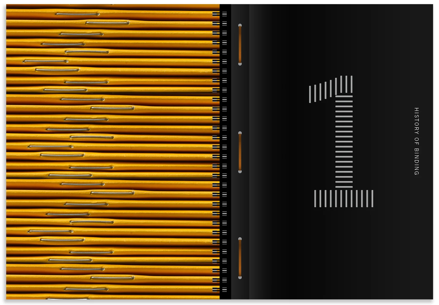

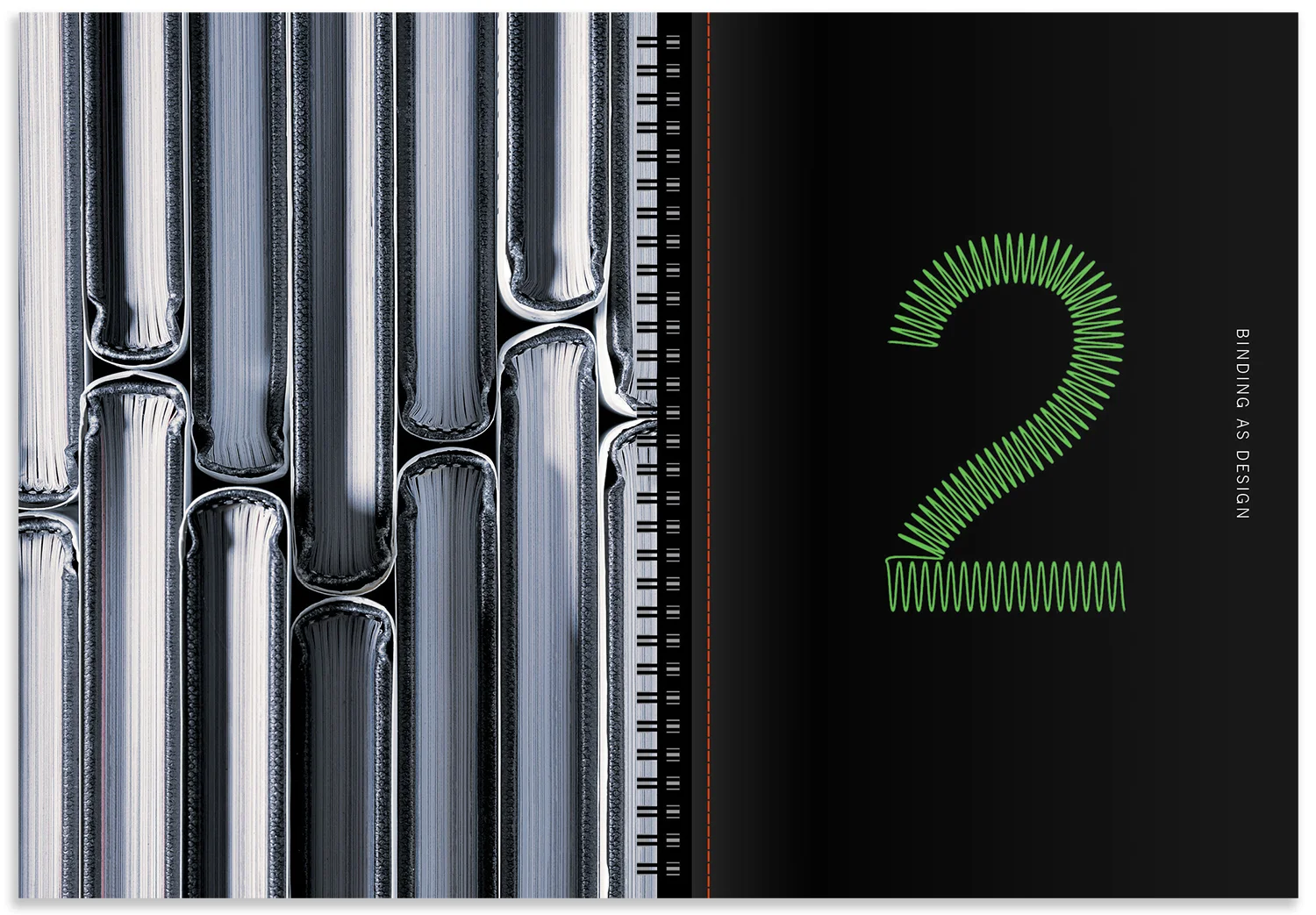

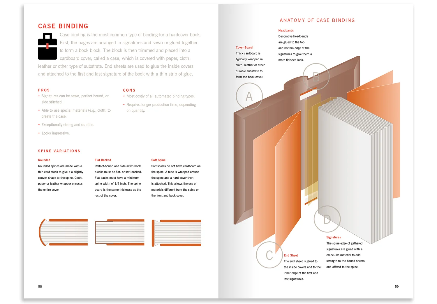
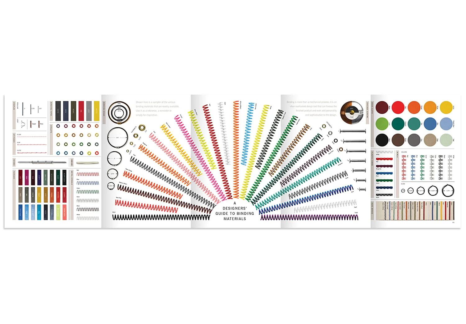
Using binding creatively is the focus of this edition. The book itself is made up of five different “books within a book,” literally demonstrating five different binding techniques available to the designer. In addition we’ve included a “graphic novel” of the historical heritage of binding, a series of binding case studies. A fold out resource poster shows at a glance various examples of binding materials printed in metallics and DayGlo inks, embossed to give the look and feel of actual binding materials.
Sappi Bindery: Created together as a complementary element to the piece, the video is created from real binding activities set to a strong percussive musical score overlaid with a factory sound track.
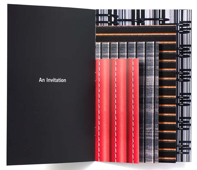
Invitations: A printed booklet invitation to a series of Sappi Fine Paper "Standard 6" events. Studio Hinrichs prepared the invitation for a series of talks that was planned to bring the book content to live audiences. The invitation is 6" x 9" and shows some of the rich, textural imagery from the Standard 6. A changeable insert sits within the final page, with information for each different event. The finishing of the invitation reflects the luxuriousness of the Standard 6, incorporating match colors and different types of spot varnish that create different textures.

The Standard 7: Packaging Perceptions

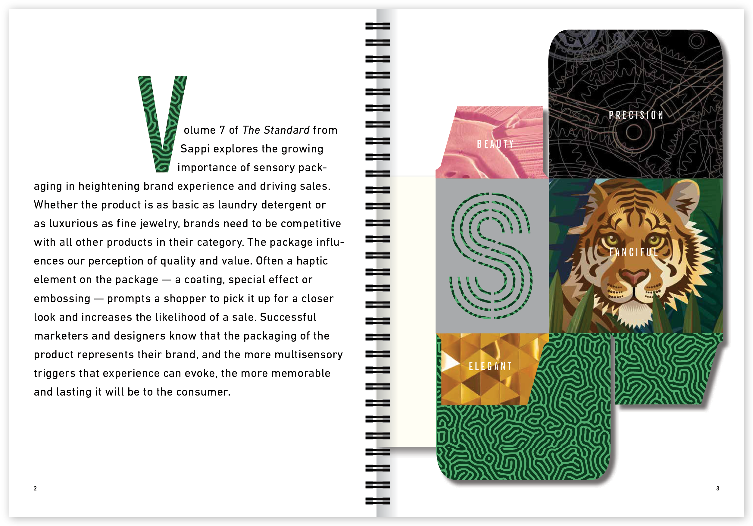


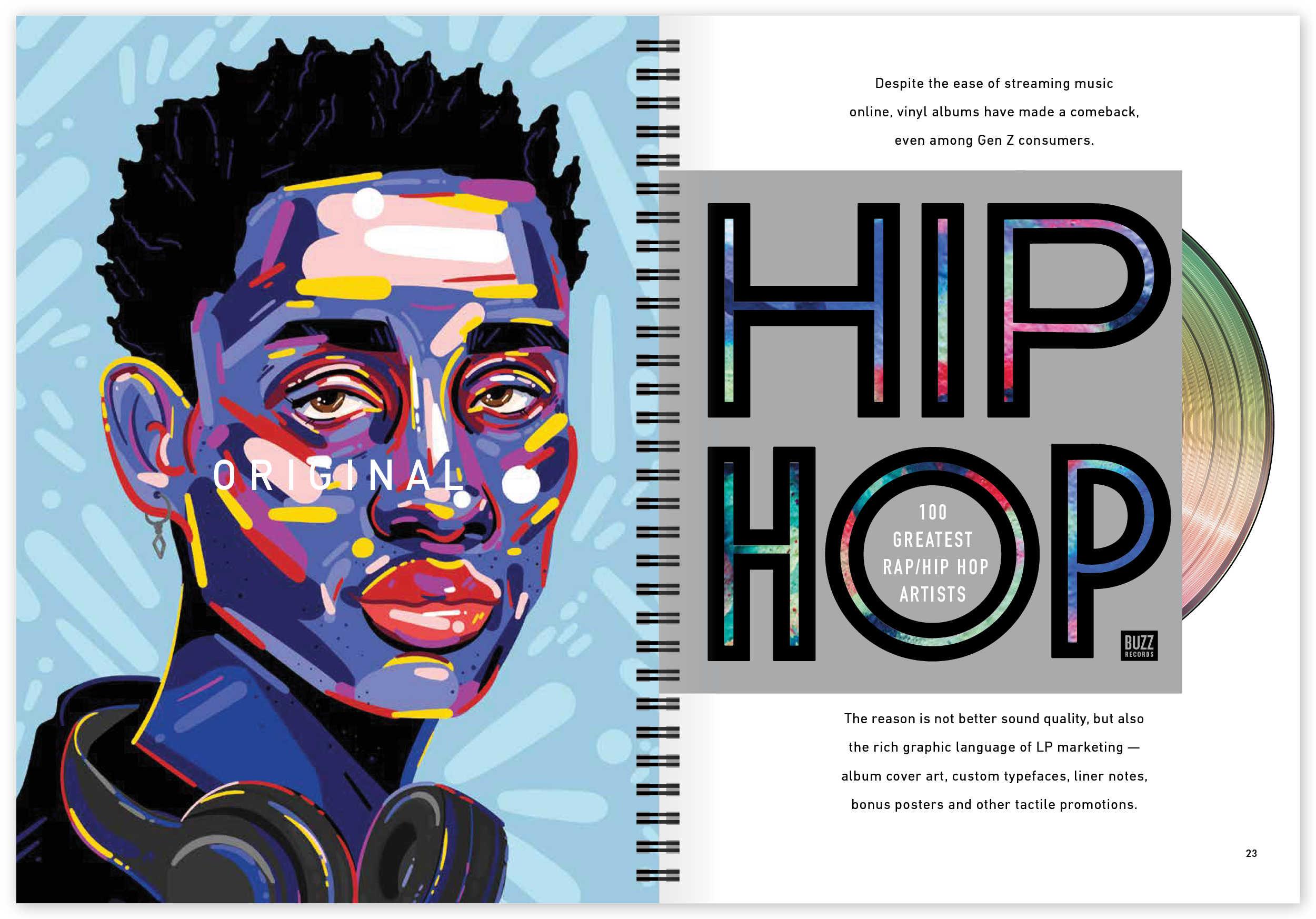
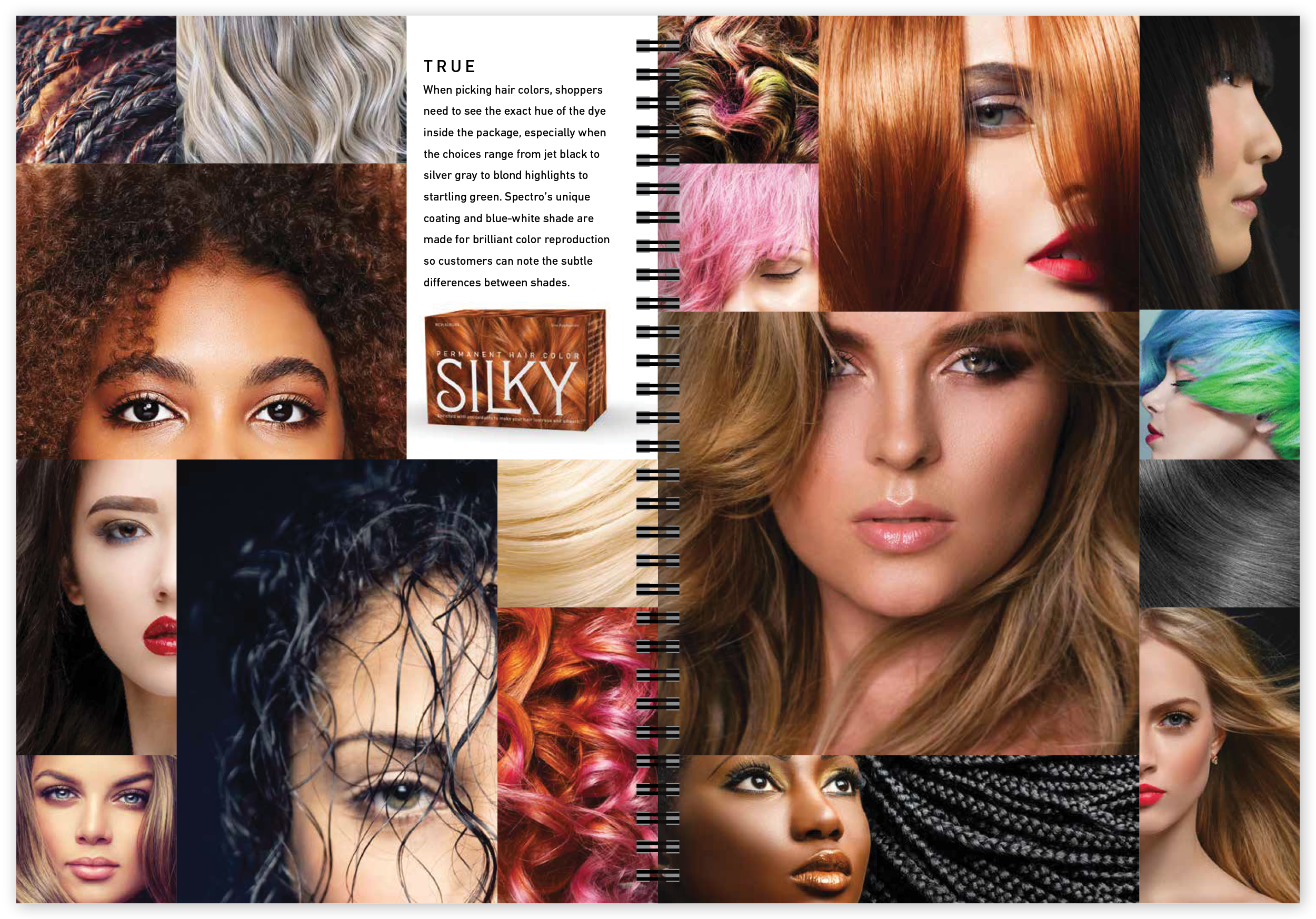


The Standard 7 examines how packaging has become the pivotal touchpoint that reinforces all the marketing efforts that preceded it. Brands of any tier, from value to luxury, must appeal to customers beyond cerebral logic. As customers form their opinions on the quality, care and trustworthiness of a brand, it is imperative that marketers understand the subconscious drivers of choice and preference. The book dives into how brands big or small can leverage the power of neuroscience to captivate audiences and build emotional connections through multisensory elements in packaging.
Hinrichs says, “The Standard 7 is the latest evolution in packaging design and printing technology. It continues to explore the value of touch and feel within the consumers purchasing experience.”
© Studio Hinrichs