Phosphor Capital
When creating the identity for Phosphor Capital, our goal was to build something that felt distinctive without being overly experimental. We wanted to push the visual language just far enough to stand apart in the venture capital space, but still keep it clear, professional, and recognizable within the field.


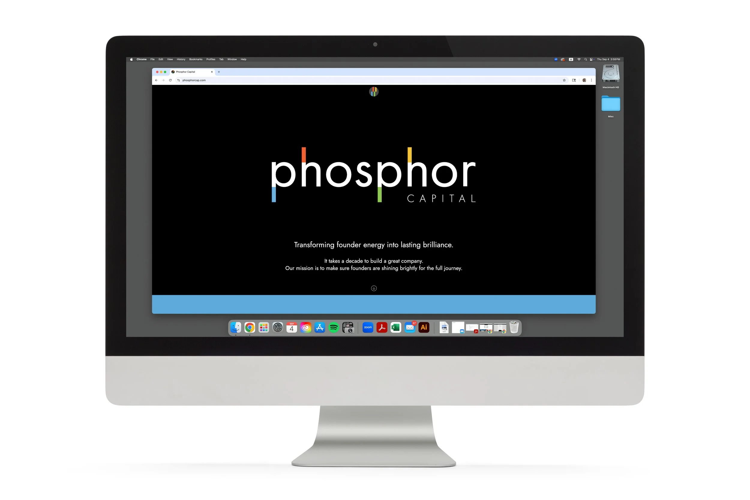
Phosphor Capital, named by Lexicon Branding in Sausalito California, was developed in reference to phosphorescence; light that continues to glow even after its source fades. This is a metaphor for the lasting success the founder brings to his clients. To carry this idea into the design, we introduced illuminated ascenders and descenders on the letterforms, shown in four colors that range across the full color spectrum from cool to warm. This subtle detail extends to the metaphor and ties to the company’s goals to its visual identity and giving the branding a distinctive and memorable quality.

We avoided design choices that risked feeling temporary, focusing instead on form, typography, and structure that would hold up over time. The result is a brand that feels current and confident.
Phosphor Capital’s website was designed by Brian Jacobs and his team at Brick Design.
© Studio Hinrichs